
The Pier Bar
Timeless Modern Community
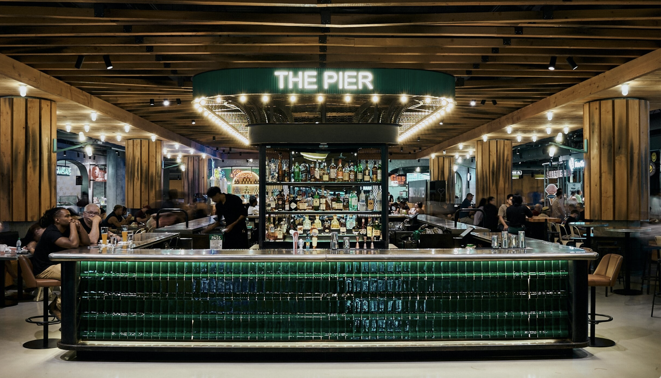
Named after the neighbourhood’s origins as a trade shortcut from the lower to upper Great Lakes, The Pier Bar provides solace, refreshment, and a social connection point for all who visit.
At Scale, I developed The Pier Bar branding. We kept the logo simple, using their existing signage. We added personality to the plain Arial font with bronze gold color and paired it with italic typography for the stacked version.
Logo drawing provided by installers to us using Arial font

Logo variations created using inspiration

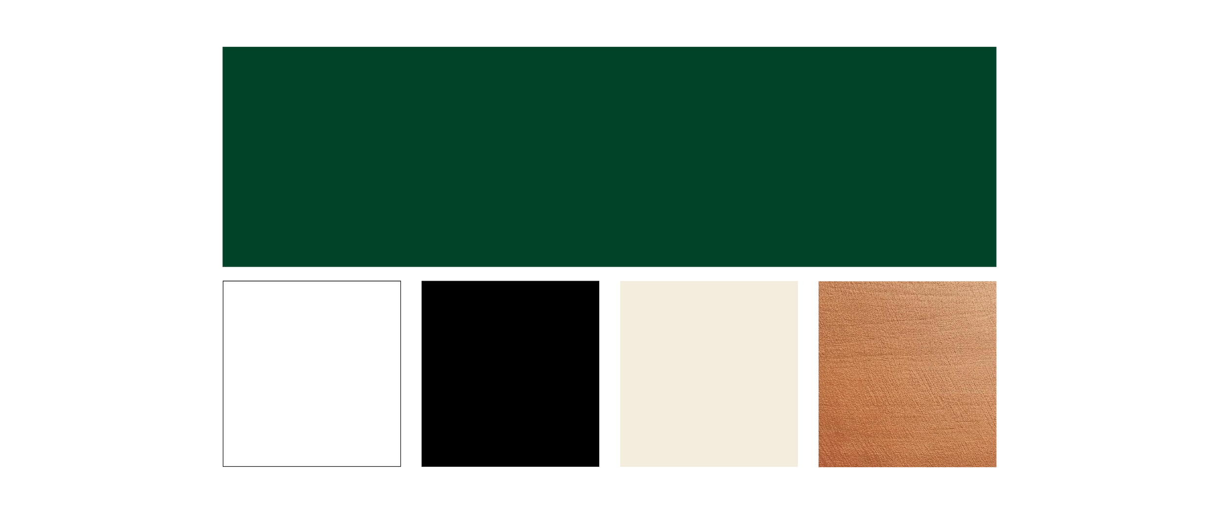
Colour palette
Patterns created from the tiles at the bar and the thin vertical lines
used on the sign installtion.


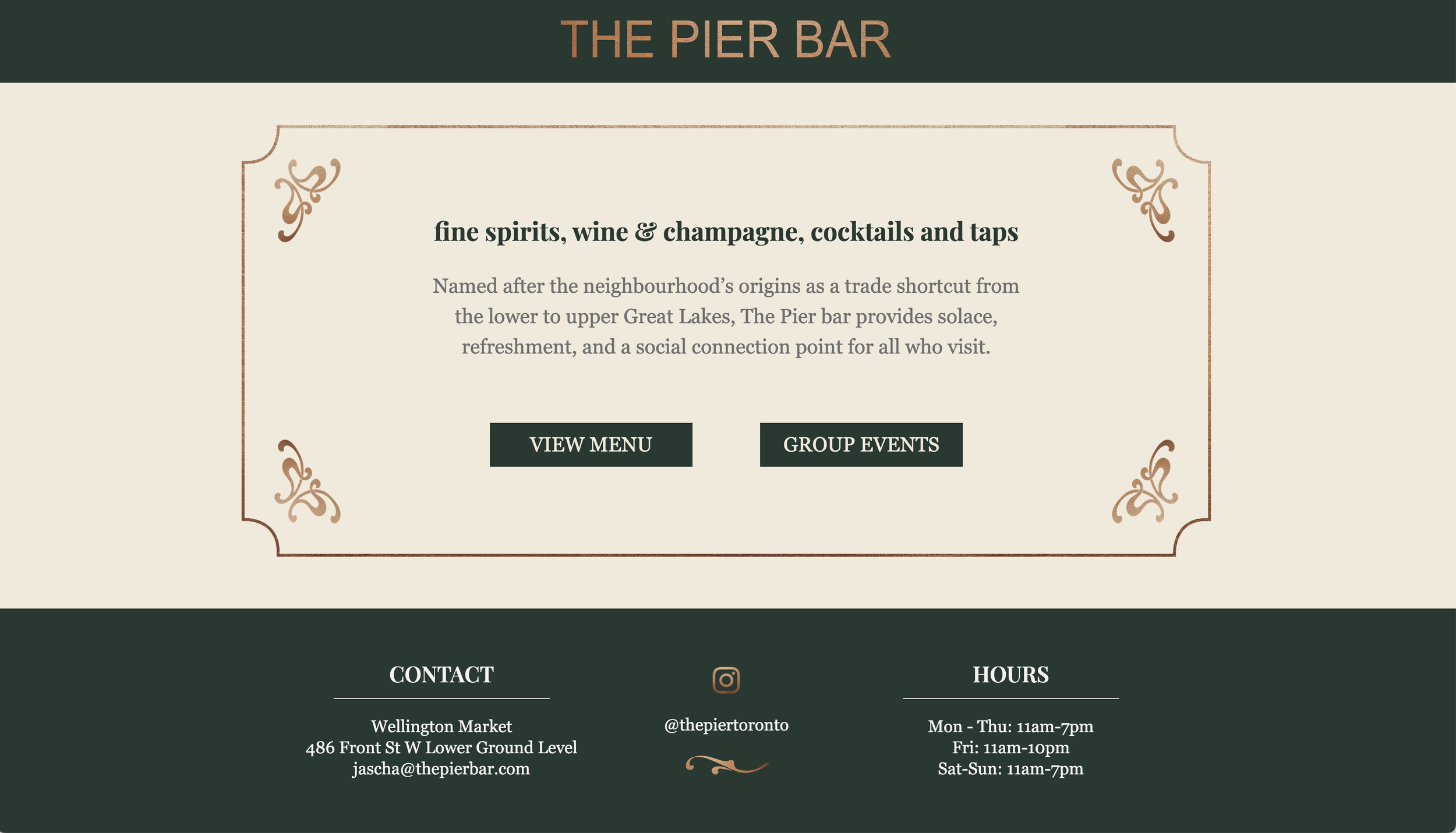
Landing page design
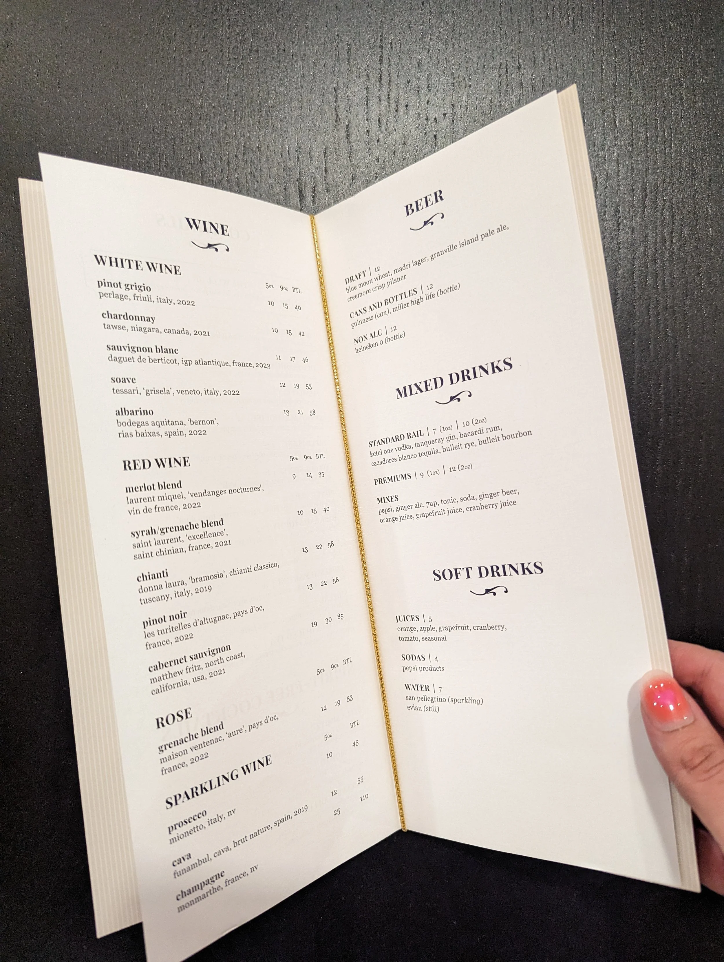
Menu design using soft touch laminate covers and a gold elastic
to bind the menu
Social media story